.webp)
Users were intimidated by long blockchain addresses, frequently made mistakes when entering them and did not trust the process. The UX felt overly technical and unapproachable, and most beginners dropped out before initiating their first crypto transfer. This produced a clear adoption bottleneck.
I redesigned the crypto‑transfer experience by replacing blockchain addresses with a simple, familiar email/ID flow, making the product instantly understandable to beginners and removing the main barrier to adoption. I validated the entire journey through high‑fidelity prototypes, which led to a 30% sign‑up conversion in usability testing.
Usability tests demonstrated a 30% conversion to platform registration — a very high number for first‑time crypto products in regulated environments.
Users were intimidated by long blockchain addresses, frequently made mistakes when entering them and did not trust the process.
The UX felt overly technical and unapproachable. Most beginners dropped out before initiating their first crypto transfer.
The bank wanted to launch a crypto‑transfer experience that could be re‑used by external partners as a white‑label product.
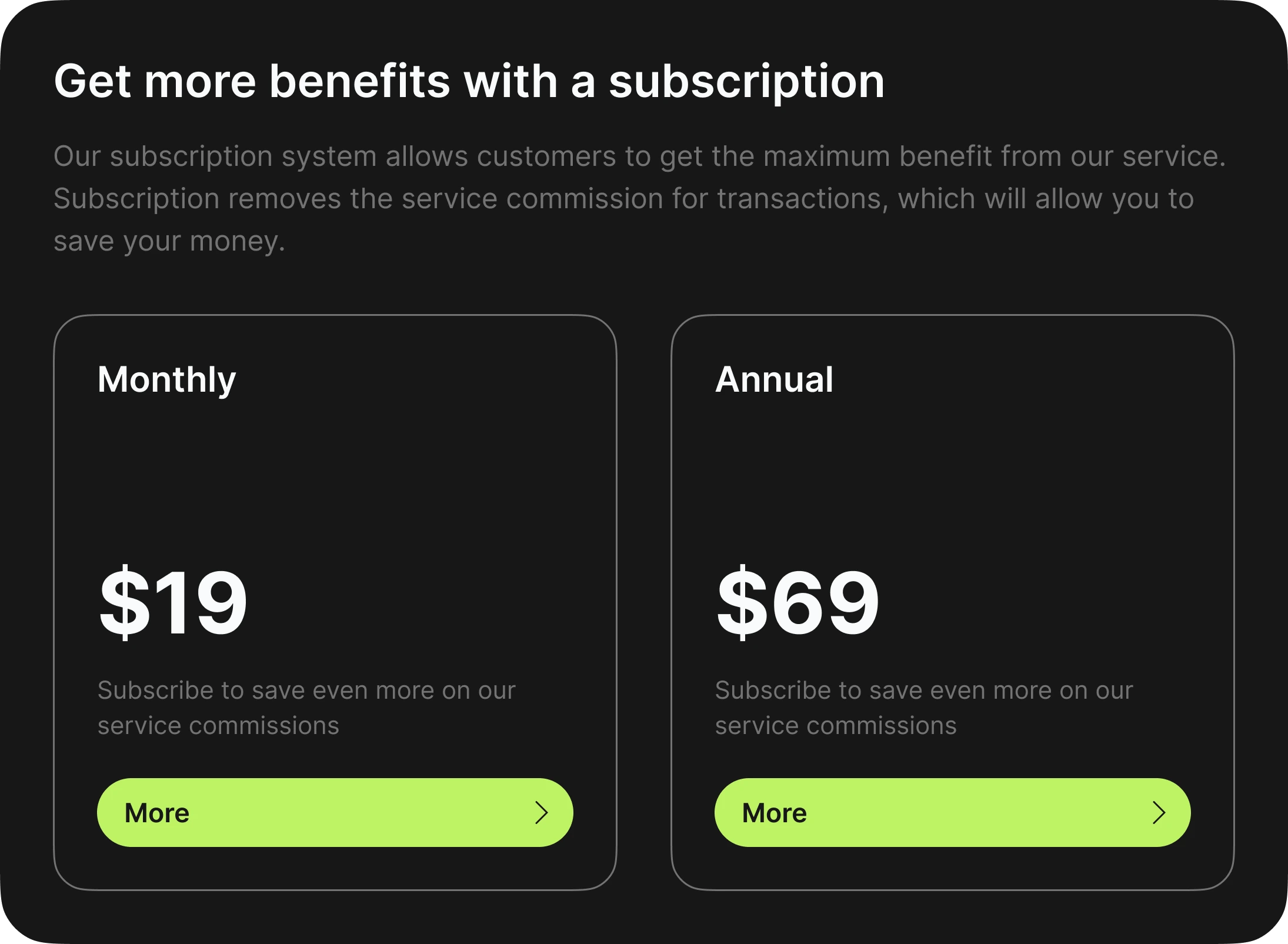
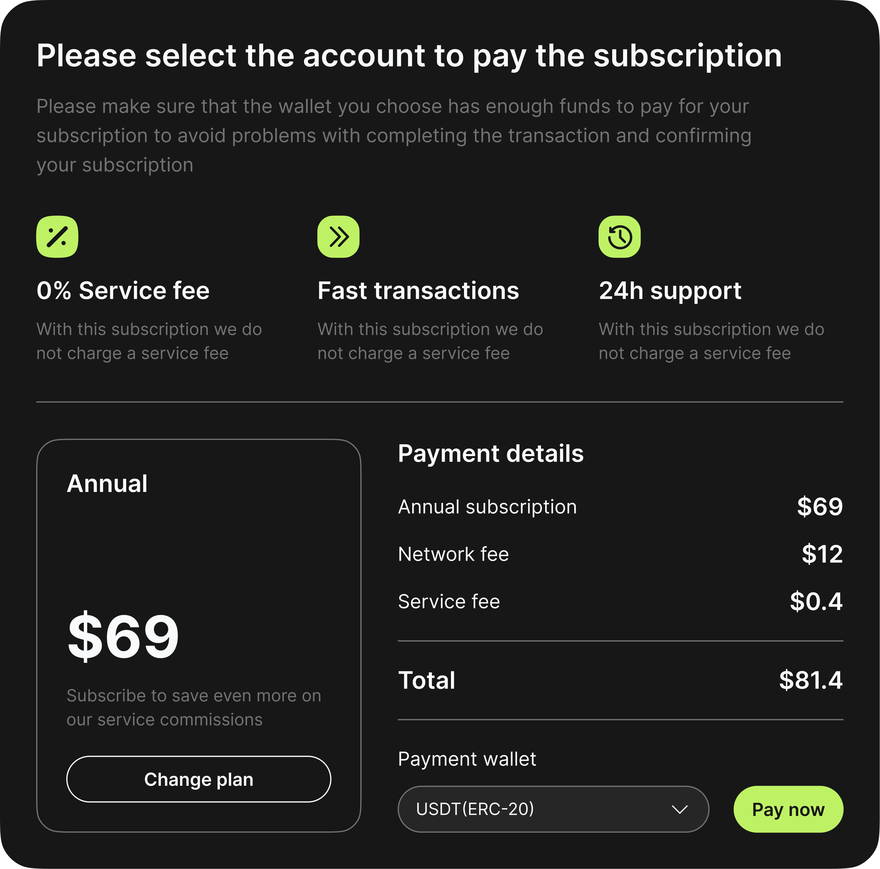
A simpler, safer flow would increase transaction volume, reduce support costs and open new commission revenue streams.
Crypto adoption was strategically important to the bank’s roadmap through 2028.
Users were intimidated by long blockchain addresses, frequently made mistakes when entering them and did not trust the process. The UX felt overly technical and unapproachable, and most beginners dropped out before initiating their first crypto transfer. This produced a clear adoption bottleneck.
Losses in crypto in 2024
Address‑accuracy anxiety
Address‑manipulation concern
With rapid change in money transfers, customers demanded higher security. I helped the company improve time‑to‑market performance and supported the go‑to‑market strategy.
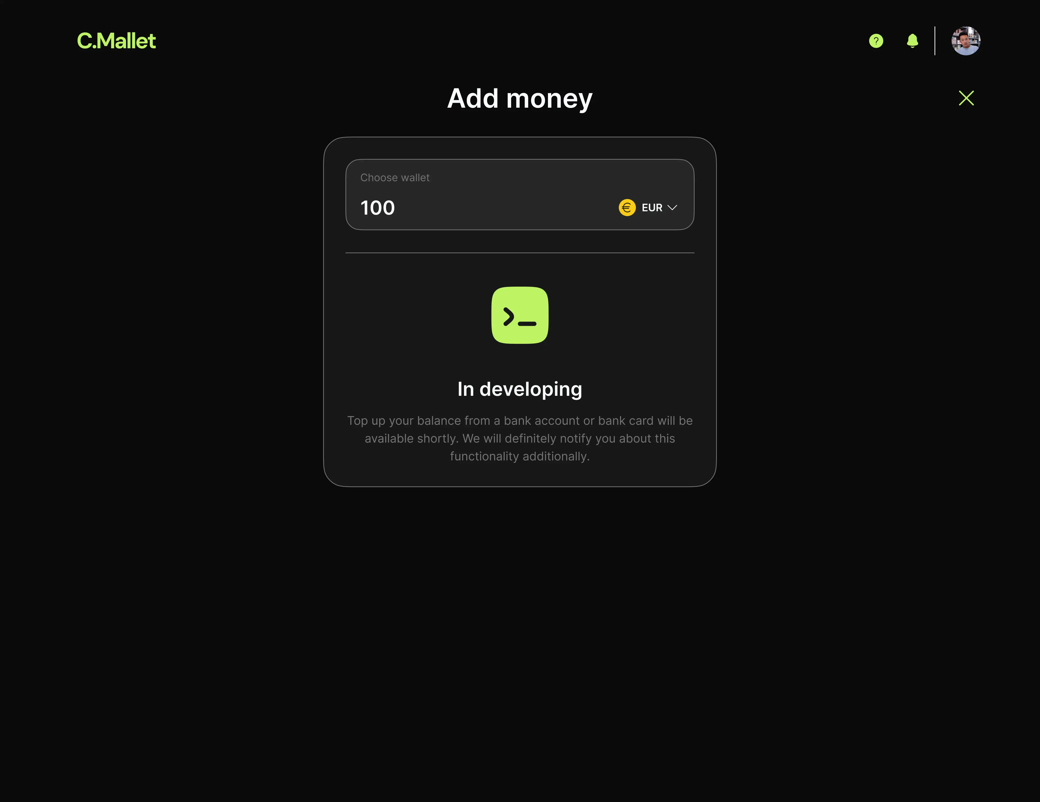
Email/ID → automatic resolution → select crypto → enter amount → confirm → send
Design decisions were shaped by strict compliance requirements and anti-fraud limitations:
Regulatory rules restricted what information could be shown before a transfer.
Anti-fraud systems required additional confirmation stages.
I designed a white‑label web app that lets users send and receive crypto using only an email or Alfa‑ID, removing blockchain addresses entirely to the back end.
I redesigned the whole flow to feel like a normal bank transfer:
enter email → system resolves the recipient → pick currency → confirm → send.
User research and prototype testing revealed several behavioural truths:
People trust email/ID far more than blockchain addresses — but emails are also easier targets for fraud, which required stronger confirmation stages.
Users expect 1–2 simple steps, not multi‑screen wizards.
I redesigned the crypto‑transfer experience by replacing blockchain addresses with a simple, familiar email/ID flow, making the product instantly understandable to beginners and removing the main barrier to adoption. I validated the entire journey through high‑fidelity prototypes, which led to a 30% sign‑up conversion in usability testing.
Demand for simplified crypto transfers
Sign‑up conversion during tests
Task‑completion rate (early validation)
This project was about learning before scaling. By stripping crypto transfers down to a familiar mental model and validating behaviour early, we reduced both product and regulatory risk. The strongest outcome wasn’t growth metrics but clarity: understanding where users trust the system, where they hesitate and where design can do the heavy lifting that technology alone cannot.